Safety signage plays a crucial role in preventing accidents and ensuring the well-being of individuals in various environments. Whether in a workplace, public space, or industrial setting, the right warning signage can be the difference between safety and disaster.
This blog provides practical advice on how to design and implement effective safety signage, focusing on visibility, clarity, and compliance with regulations. Understanding these elements is essential for creating signs that not only meet legal standards but also genuinely contribute to a safer environment.
As safety protocols continue to evolve, the importance of comprehensive safety training, such as first aid training courses and fall protection training, cannot be overstated. These courses equip individuals with the knowledge and skills needed to respond effectively in emergencies.
Similarly, well-designed warning signage serves as a constant reminder of potential hazards, guiding people to take the necessary precautions.
Let’s explore the key factors to consider when designing and implementing warning signage, ensuring that your signs are not just compliant but also highly effective in promoting safety.
The Importance of Clear and Visible Warning Signage:
Effective warning signage is the foundation of any safety protocol. It alerts individuals to potential dangers, guiding them to make safe decisions in hazardous environments. To serve its purpose, warning signage must be both clear and visible. This means choosing the right colors, fonts, and symbols that can be easily recognized from a distance
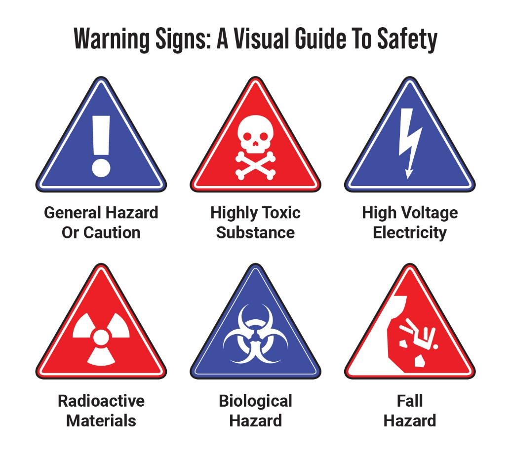
The use of universally understood symbols, such as a skull for toxic substances or a lightning bolt for electrical hazards, can enhance the immediate recognition of the danger.
Visibility is particularly important in environments where conditions can change rapidly, such as in construction sites or factories. Signs should be placed at eye level and in locations where they are easily noticeable.
In areas where lighting conditions are poor, reflective materials or illuminated signs can improve visibility. The goal is to ensure that the warning is seen and understood before an individual enters a dangerous area.
Moreover, the clarity of the message is crucial. While it’s important to include enough information to convey the hazard, overloading the sign with text can reduce its effectiveness. The use of simple language and direct instructions, such as “Wear Protective Gear” or “Danger: High Voltage,” ensures that the message is understood quickly and without confusion.
For more comprehensive safety protocols, such as those taught in advanced first aid courses or confined space training, signage should provide enough information to complement the training without overwhelming the reader.
Regulatory Compliance in Safety Signage:
Compliance with safety regulations is non-negotiable when it comes to warning signage. Regulatory bodies, such as the Occupational Safety and Health Administration (OSHA) in the United States, set strict guidelines on the design, placement, and content of safety signs.
These guidelines are designed to ensure that signs are not only visible and clear but also standardized across different environments, making them easily recognizable regardless of the setting.
Understanding these regulations is crucial for anyone responsible for implementing safety signage. Non-compliance can result in hefty fines, legal issues, and increased risk of accidents.
The specific requirements can vary depending on the location and the nature of the hazard, but generally, regulations will cover aspects such as sign size, color codes, symbols, and the use of signal words like “Danger,” “Warning,” and “Caution.”
For example, OSHA mandates that warning signs for hazardous materials must include specific colors and symbols that are universally recognized.
Similarly, the American National Standards Institute (ANSI) provides guidelines on the use of signal words and their corresponding colors—red for “Danger,” orange for “Warning,” and yellow for “Caution.” Compliance with these standards not only ensures legal adherence but also enhances the effectiveness of the signage by making it consistent with what individuals have been trained to recognize in first aid training courses or intermediate first aid courses.

Recognizing essential safety symbols is key to preventing accidents in hazardous environments.
Designing for Specific Environments:
Different environments pose different challenges for warning signage. What works in a quiet office setting may not be effective in a noisy construction site or a dimly lit warehouse. Therefore, it’s important to tailor your signage to the specific environment in which it will be used.
In industrial settings, for instance, where heavy machinery is in use, signs need to be durable, resistant to wear and tear, and easily visible even in dusty or foggy conditions. The materials used should be chosen with these factors in mind—metal signs may be more appropriate in outdoor environments, while vinyl or plastic signs might be suitable for indoor use. Additionally, incorporating reflective surfaces or using LED lighting can enhance visibility in low-light conditions.
In environments where noise is a factor, such as factories or construction sites, visual cues become even more important. Large, bold fonts and clear symbols that can be easily recognized from a distance are essential.
Additionally, color coding is a powerful tool in these settings. Using bright, contrasting colors can help ensure that the signs stand out against the background, even in a visually cluttered space.
In settings like hospitals or schools, where the audience may include individuals of varying ages and backgrounds, the language used on signs should be simple and easily understandable by everyone. In these environments, it may also be beneficial to include signs in multiple languages, especially in areas with diverse populations.
The importance of environment-specific design is often emphasized in safety training programs. For instance, basic first aid training may cover the importance of recognizing and responding to signs indicating the presence of first aid stations, while confined space training might focus on understanding signage related to restricted areas. By tailoring your signage to the specific needs of the environment, you can significantly improve its effectiveness.
Maintaining and Updating Safety Signage
Once the signage is in place, it’s essential to maintain it regularly. Over time, signs can become faded, damaged, or obscured by dirt and debris, reducing their effectiveness. Regular inspections should be conducted to ensure that all signs are in good condition and remain visible. If a sign is damaged or becomes difficult to read, it should be replaced immediately.
In addition to physical maintenance, it’s also important to review the content of the signs periodically. As safety procedures and regulations evolve, the information on your signs may need to be updated. For example, if new hazards are introduced to an area or if the layout of a workspace changes, the signage should be adjusted accordingly.
Training programs such as advanced first aid courses and fall protection training often include sections on recognizing outdated or ineffective signage. Employees who have undergone this training can be valuable resources in identifying signs that need to be updated or replaced. Encouraging employees to report any issues with signage can help ensure that all hazards are clearly communicated at all times.

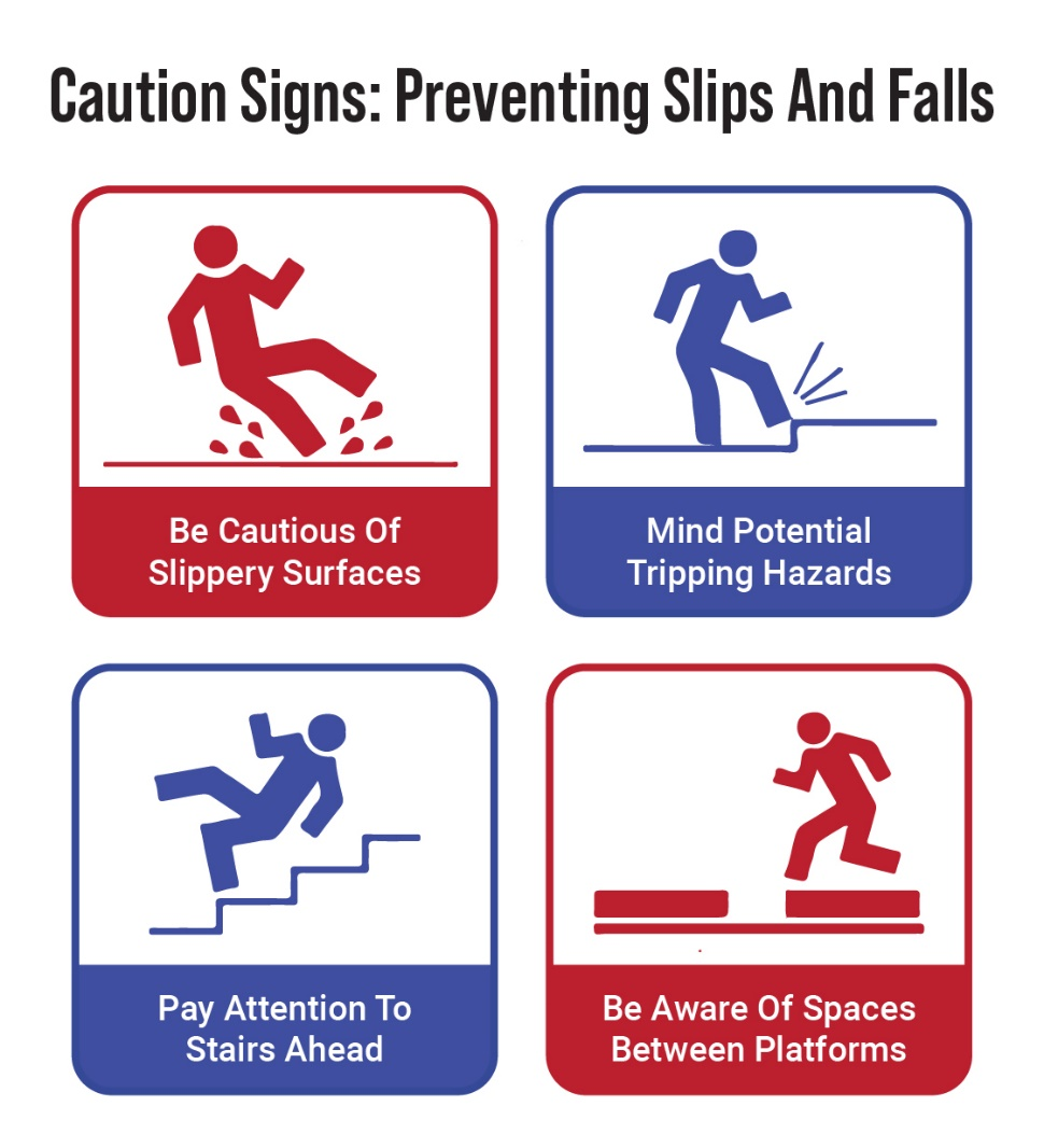
Stay alert to warning signs that help you avoid hazards and stay safe in the workplace.
The Role of Training in Understanding Warning Signage:
While effective signage is essential, it is only one part of a comprehensive safety strategy. Training plays a critical role in ensuring that individuals understand and respond appropriately to warning signs. Programs such as first aid training courses and confined space training teach participants to recognize and interpret safety signs, as well as to take the necessary actions in response to them.
In many cases, the effectiveness of a sign depends not only on its design but also on the viewer’s ability to understand its meaning. For example, a sign indicating the presence of hazardous materials might be clear and visible, but if an individual does not know what actions to take in response, the sign’s effectiveness is diminished. This is where training becomes invaluable.
Through training, individuals learn to recognize the different types of warning signage and the specific actions they should take when encountering them. This training is reinforced through regular drills and practical exercises, ensuring that the information is retained and applied in real-life situations. For example, participants in intermediate first aid courses might practice responding to signs indicating the location of first aid supplies, while those in fall protection training might learn to identify and react to signs warning of fall hazards.

Effective signage for snow clearing in progress helps keep pedestrians and drivers safe during winter conditions.
Enhancing Safety through Effective Signage:
Creating effective warning signage is a critical aspect of maintaining a safe environment. By focusing on visibility, clarity, and compliance, you can design signs that effectively communicate hazards and guide individuals to take the necessary precautions. Additionally, by tailoring signage to the specific environment and maintaining it regularly, you can ensure that it remains effective over time.
However, it’s important to remember that signage alone is not enough. Comprehensive safety training provided by Metro Safety Training, in Vancouver and Surrey, such as first aid training courses, advanced first aid courses, intermediate first aid courses, basic first aid training, fall protection training, and confined space training, is essential to ensure that individuals understand and respond appropriately to the warnings provided by these signs.
Contact Metro Safety Training today to learn more about how our services can support your safety goals.


